/ Authenticate Case Study
CASE STUDY · 2024
// from an API to a platform
Redefining the home page for Authenticate's admin dashboard
Authenticate grew from an API into a platform. The home page hadn't been built for that.

Where this started
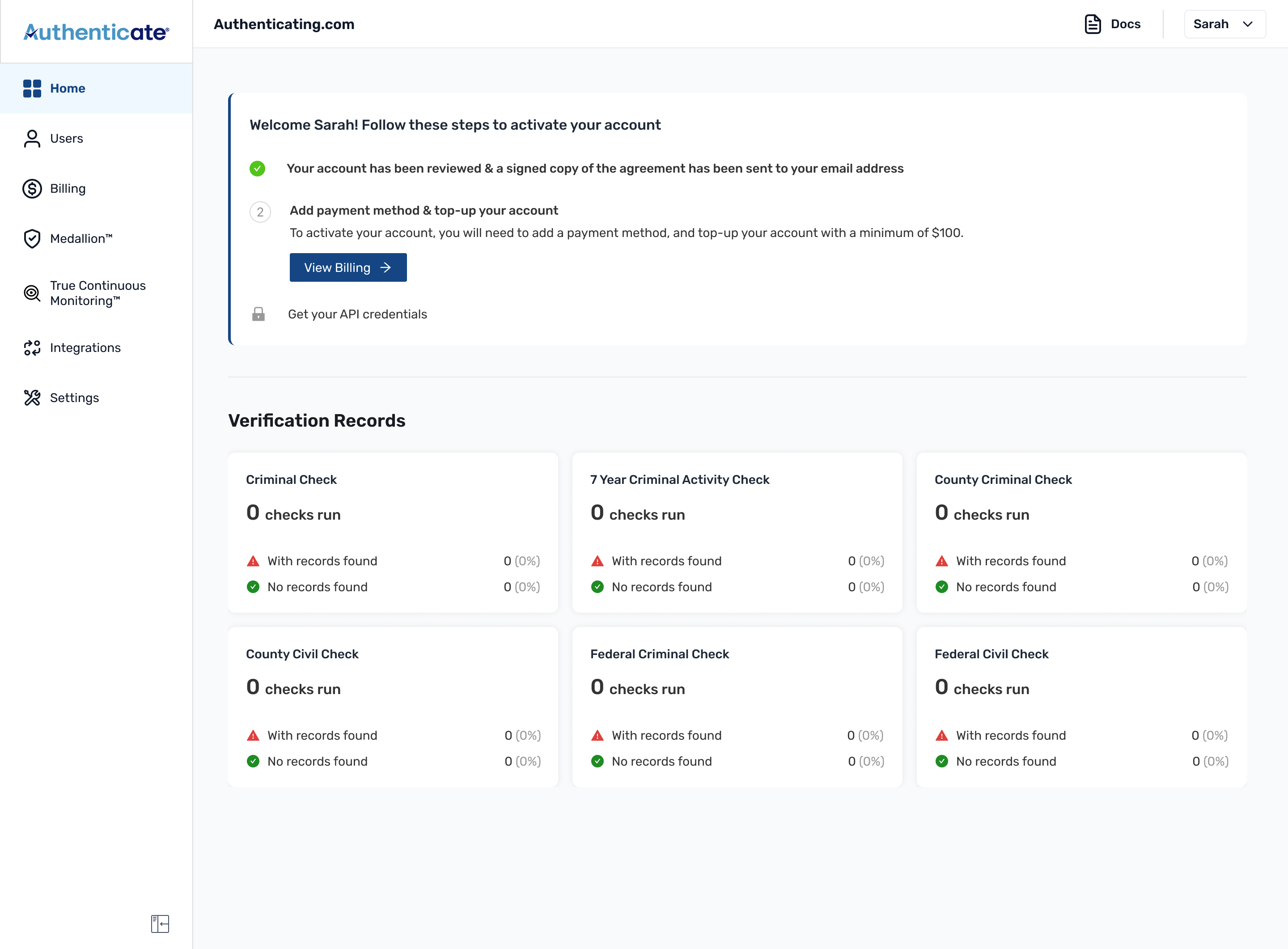
An API-first company, and a home page built for developers.
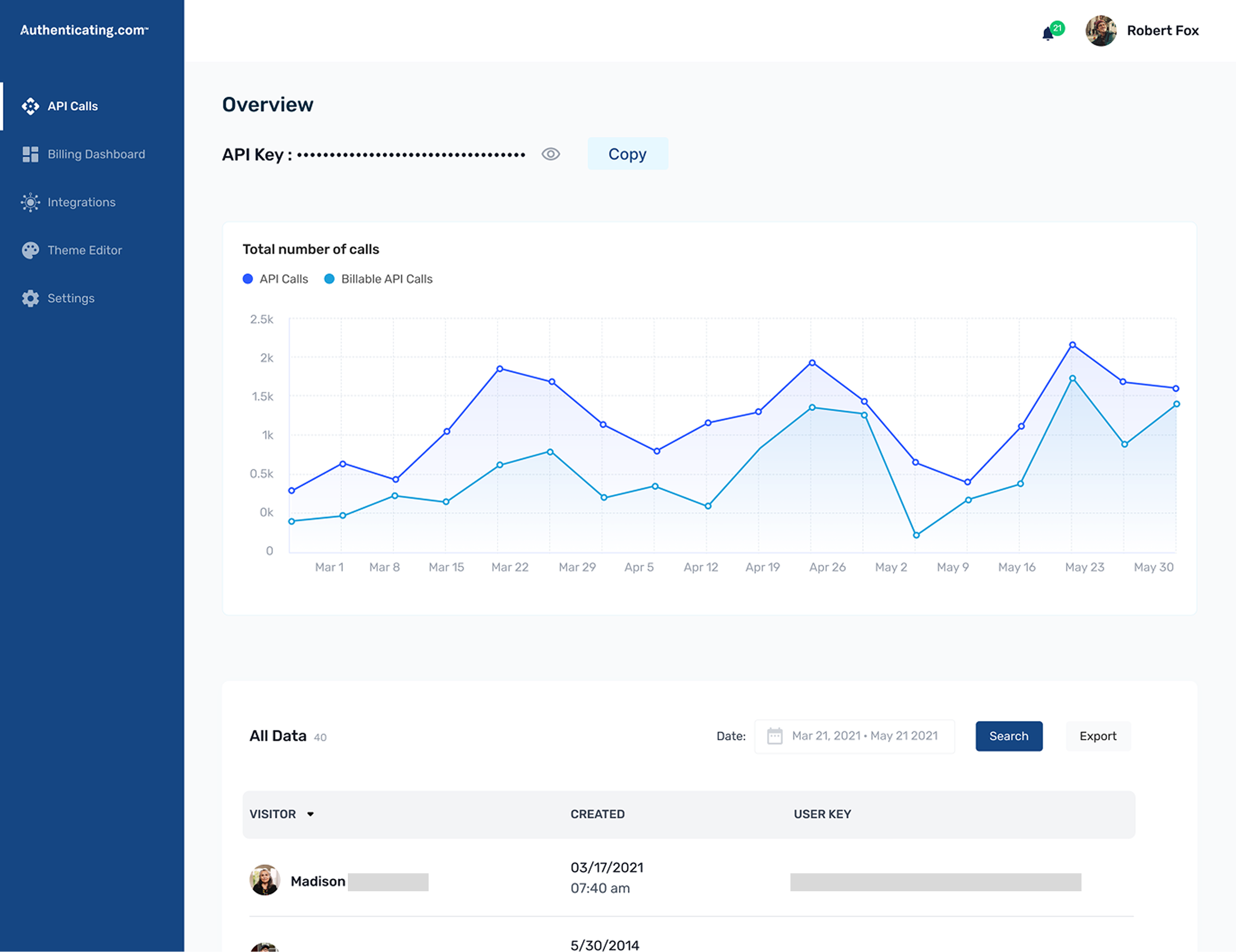
Authenticate began as an API-first company. Developers wired identity checks into their own product, and the home page was built around that: API Calls vs Billable API Calls in a chart, the API Key sitting above the fold, a sidebar that read API Calls, Billing Dashboard, Theme Editor. For a developer it was fine. That's the page they needed.
Then Medallion came along and changed what the product did. Medallion™ is Authenticate's live, guided identity-capture flow. It walks a user through photographing their ID correctly the first time. Before it, verification meant uploading a static photo of a licence or passport, and people got it wrong constantly: blurry, cropped, glare across the photo. They'd re-upload the same ID five or six times before it went through. Medallion replaced that guesswork with a flow that assists the capture as it happens.
And that quietly changed who the product was for. It wasn't just an API you set up once and forgot. It became something teams ran day to day, configured, leaned on. The dashboard was shifting the same way, from manual towards configuration and assist.
The API never went anywhere. Anyone who wanted to build on it still could. But it wasn't the main story anymore. Medallion was, because it addressed what customers actually needed: a faster, more reliable way to get verifications right. The home page was still built around the API path, though: the calls chart, the key, the developer framing all up front.
This redesign wasn't about fixing a page that had fallen behind. It was about designing the home page for the use case Medallion had created.
What was wrong with it
A heuristic evaluation sorted the problems into four.
FUNCTION
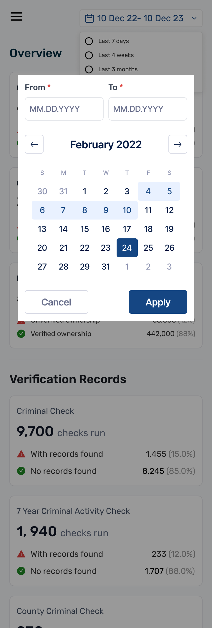
There was also a specific nudge from a customer, call them X. They'd formally asked for one thing: to view their usage over custom date ranges, which the product couldn't do yet. It turned out to be the right thing to build around. You can't add a real date filter without making the chart interactive and giving the page a sensible default, so the one feature they asked for pulled most of these problems along with it.
The question that shaped everything
Before I made anything, the PM and I worked through one question.
"What do we want this page to do?"
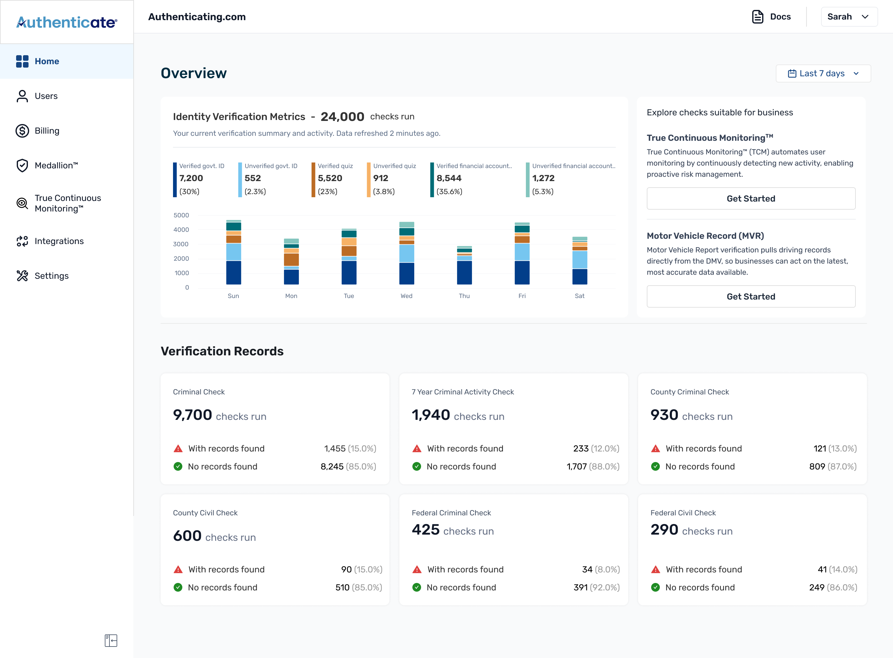
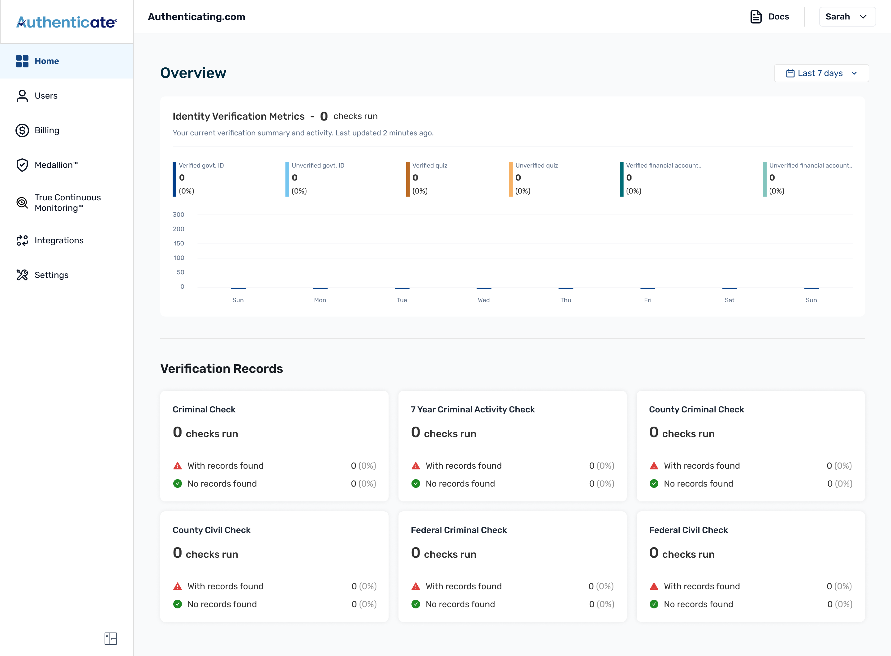
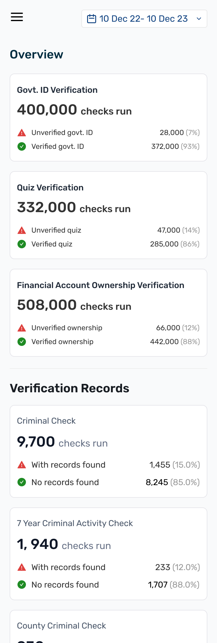
Not "what should go on it." Ask that and you just get a wishlist. The better question was what decision someone makes when they open it. When an operator opens the home page, they're really asking three things: are my verifications going up or down, is anything broken, and is there a single check worth clicking into.
Authenticate runs a lot of different checks (identity, criminal, civil, background screening, continuous monitoring), and the page had to hold all of it without turning into a wall of numbers. So I split it in two:
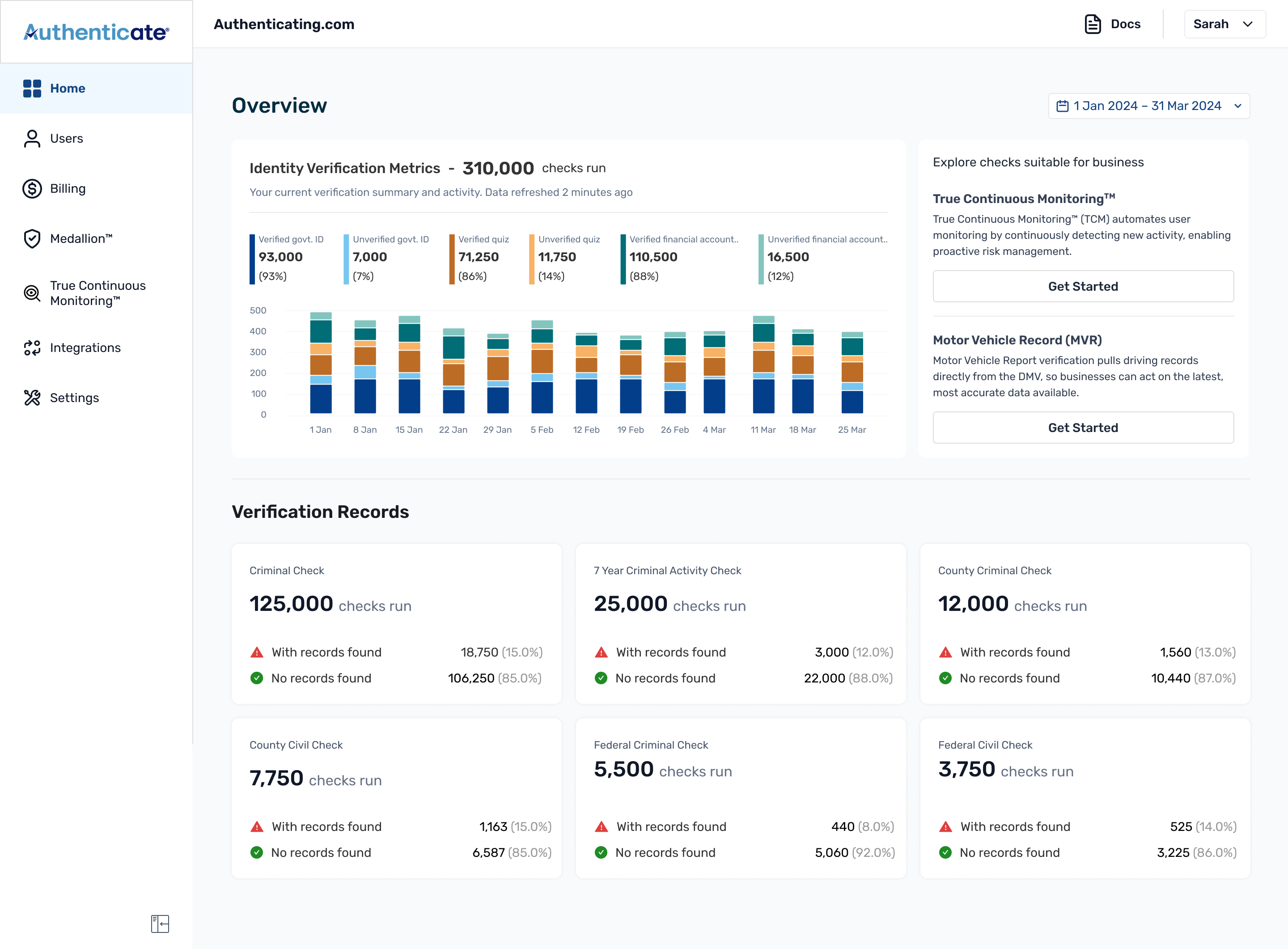
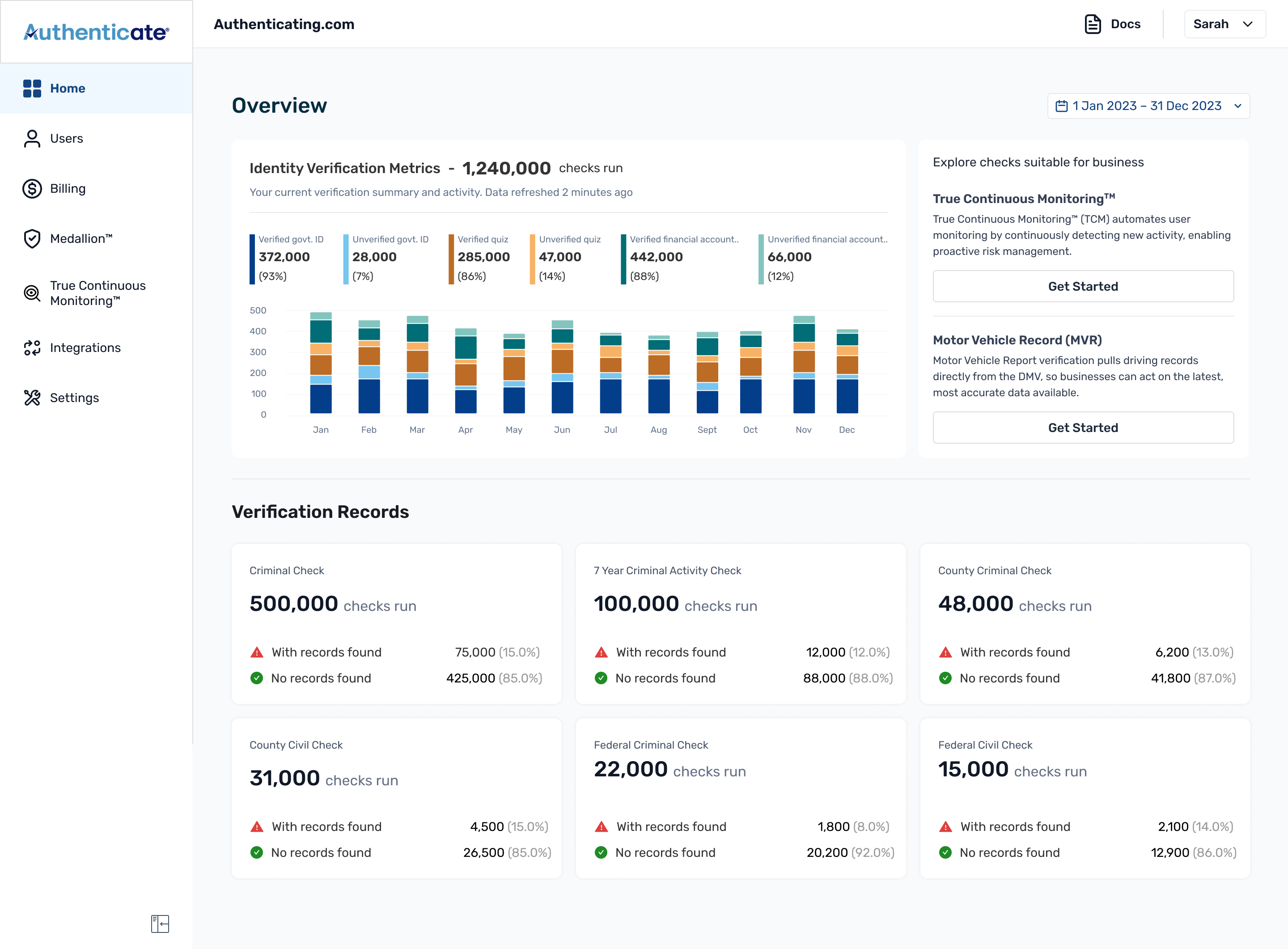
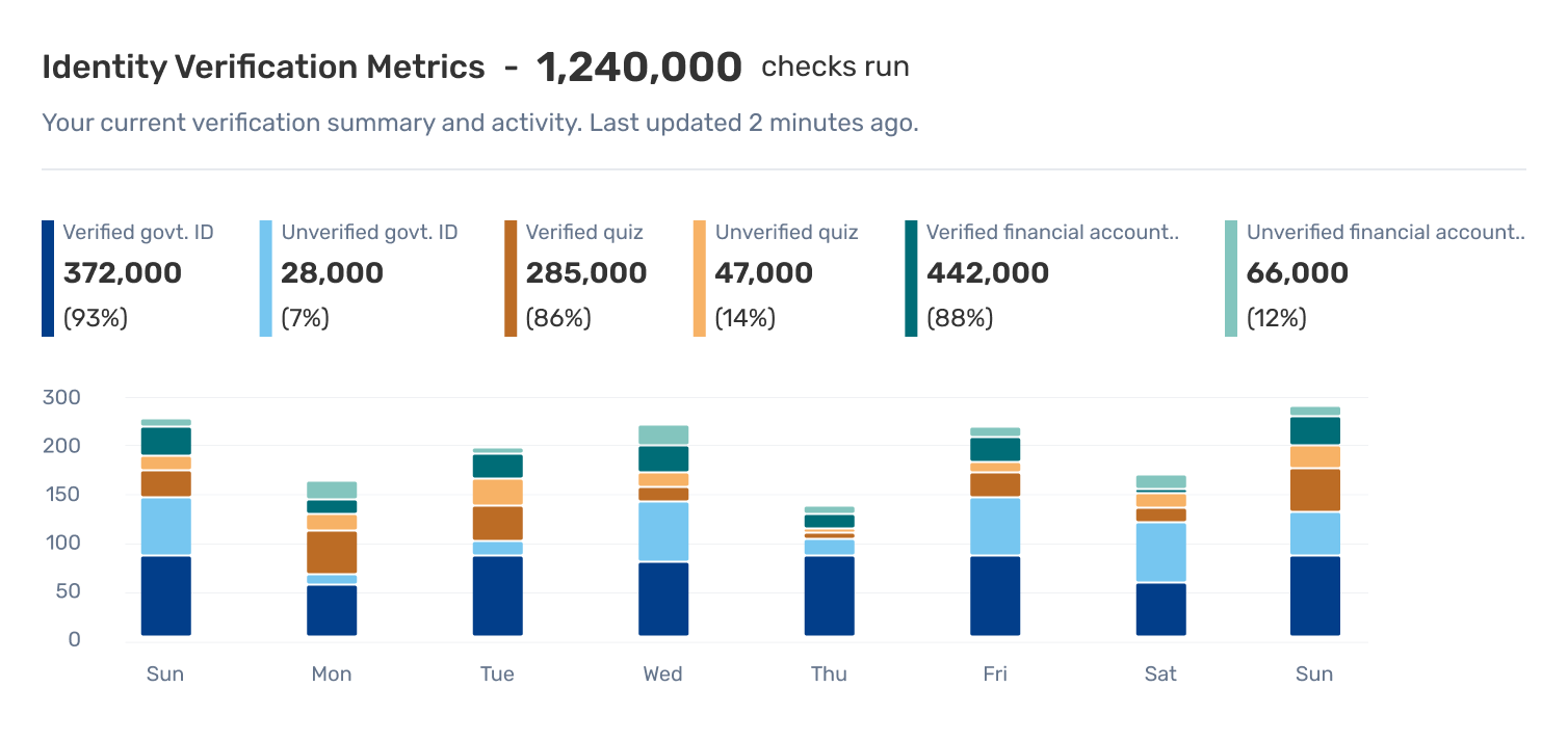
The chart
Three verification categories at once, each split verified / unverified: six things on one chart.
I thought of a line graph first, but it didn't work: six lines crossing over each other, hard to read, and worse, it made tiny gaps between lines look like they meant something when they didn't. A stacked bar fixed both problems. Each bar holds the whole category together: the total, the verified/unverified split, and where it sits in the time range, all in one block.
The grouping flexes with the date range so the chart stays readable however far you zoom out. A short range groups by day; around 90 days, it switches to weekly; longer still, by month. You never have to think about it: the chart picks the unit that keeps the bars legible.
The date filter
Top-right, not because it's clever, but because that's where every tool the customer already uses keeps it.
Stripe, Mixpanel, Amplitude, Segment: basically every tool a customer has used before opening Authenticate already puts it there. There was no reason to make people relearn something they already knew. The actual thinking went into what's inside it.
One number that answers the first question
The breakdown is the detail view. It isn't the first thing most people want.
The graph carries the full breakdown: three verification categories, each split into verified and unverified, with percentages so customers can see the make-up of their usage. That's the detail view, and it's there for anyone who wants it.
But the first question on opening the page is simpler: how many verifications happened in this window? So alongside the graph I specified a single aggregate count: the total checks run across Identity Verification, KBA, and Government ID for the selected range, updating with the filter. One number, read in about a second, with the full breakdown sitting right below it for when someone wants to go deeper.
The promo card, without making it feel like an ad
A promo card in a compliance product can't read as salesy, but people were missing things they'd already paid for.
Marketing came to us with a real problem: a good chunk of customers were paying for additional verifications already in their plan and had never touched them. They wanted to surface those inside the product instead of just emailing people about it. So I made the card change depending on what the customer had actually tried. The page gets cleaner the more someone uses the product, instead of nagging them about what they already know.
The sidebar
The moment the navigation stops describing an API and starts describing the platform.
The old sidebar led with API Calls. The new one leads with Home and names what the product had become (Medallion™, True Continuous Monitoring™) alongside the existing items. It's a tiny change and one of the most important in the whole redesign. We also updated the visual design of the sidebar.
The states a screenshot never shows you
Most of the design time went to the full dashboard. Most of the thinking time went to the states before it fills up.
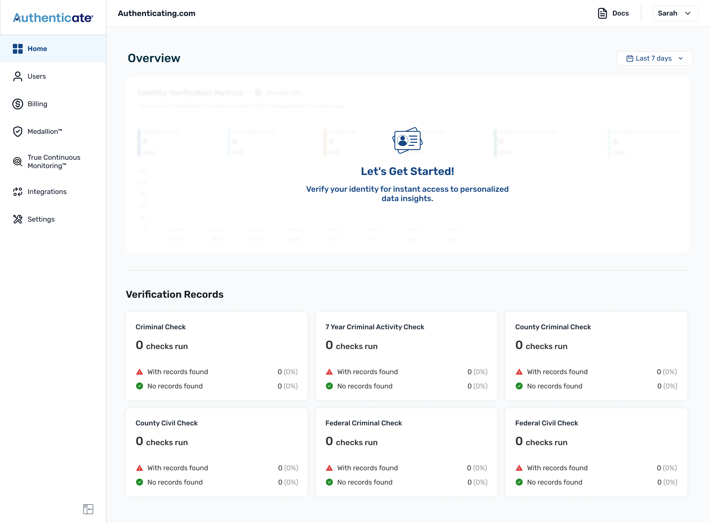
A new customer doesn't land on a dashboard full of data. They land on an empty one, and that first impression decides whether the product feels broken or just new. So I designed the page backwards from zero:
Mobile
Most users were on desktop, checking data between things, in a queue, between meetings. They just want to know things are on track, so mobile had to be lighter on purpose.
I couldn't just shrink the desktop view down. I cut two things. The chart went first: a six-segment stacked bar is tough to read on a phone. Then the promo card, because it would've eaten half the screen and buried the actual numbers.
I still wanted people to see the numbers, just not as a chart. So I kept the three identity verification summaries (Govt ID, Quiz, Financial Account), then stacked the verification records under them, all in one scroll. I kept the date filter too, so you can still narrow it to a week or a month if you want. Same question as desktop, are things on track, just without making anyone pinch-zoom a chart to answer it.
Before & after
What changed
Started February 2024, shipped 8 weeks later in April 2024.
I didn't have engagement tracking in place at launch, something I'd fix first if I did this again, so I can't point to clean before/after numbers. But a few things did change, and I can stand behind these: